Hi everyone! Today is the day 2 of Armchair BEA 2016!
Today is all about aesthetics! The first part of this topic is concerned specifically with books, and the second with blogs. For more info about the daily challenges, go to Armchair BEA’s website, prizes await!
…..Books Aesthetics…..
I’m a serious book cover judger. I tend to pick up most of my reads just by seeing the covers alone and without reading their synopsis. Why? Because I feel that if the publisher/author put much thought and effort to choose the right cover for the book, then chances are, they put as much of an effort in delivering a high quality story. Also, because they look pretty on bookshelves and I like to pet them!
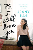
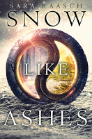
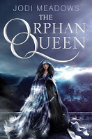
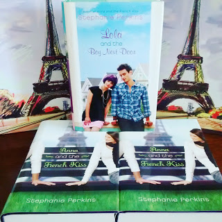
*Some pretty books with amazing stories*
Of course, there are times when a book, no matter how beautiful its cover is, isn’t at all the story I wanted to read. There have also been times when books that don’t have a nice cover, turn out to have wonderful stories underneath its not so generous facade. When this happens, I get terribly upset because these stories deserve a beautiful cover so people would feel inclined to pick them up. Because the majority of bookworms LOVE their books with pretty covers. That’s the hard and terrible truth.
But I know that getting a beautiful cover design can be quite expensive, especially for indie authors who have to cover ALL the costs of books, from page design, cover and printing. So when indie authors pitch me for book reviews, I tend to change my rules: I hardly look at the cover, and instead, I read the synopsis.
One thing that I do think as unforgivable is when book covers in a series don’t match or they change design mid-series. Whyyyy? I want my books to match! (if in physical, as ebooks it doesn’t matter that much). Like the unforgivable thing that happened with the Anna and the French Kiss series. They were so amazing and perfect, just look at them! The new covers are pretty too, but not as good as these ones. *sniff*
Anywhoo, I try to have books in series in the same format, as in if I have the first book in paperback, I get the rest in paperback as well. However, I do have a few series that are in a mix of editions (pb, hardback and ebooks). If I were rich, I would get all my books in hardback and die happy. 🙂
…..Blog Aesthetics…..
Funny how in books I am strict about the aesthetics, but with my blog, I am not that much. I’m still struggling to establish my image brand, like update my blog icons and blog posts header. I want them all to match and for them to be instantly recognizable as The Reader and the Chef’s style. Will work more on that soon and will try to improve my designing skills.
Still, I have tried to keep my blog’s theme throughout all changes after 2 years of blogging. The book and the chef hat icons have remained, since they represent me as the reader and my sister as the chef. As for color themes, I love pastels and a few bold colors like red and purple. For my font, I use Georgia because it rocks and I love it!
My review style is… me. I fangirl, I sometimes use gifs, but I generally keep it 5 paragraphs long. When I have lots to say, it may go on longer! My sister tends to include food inspiration on her book reviews which I find pretty cool.
And that’s it for today! 🙂




Oh, I hate when they change covers, too! Though mostly because I'd love to know how the next would have looked. Most of the time I only buy the last book of the series in print, and the others for my kindle because shipping here is a pain in the ass! so I don't get too mad when covers don't match.
And… I love how your blog looks! It's so clean! <3